BLOG: St Mary Le Strand
As part of our inspiring buildings series MEB Design Director Mark Eddison, reflects on the inspirational St Mary Le Strand in London. Check out his blog below.
My favourite building: St Mary Le Strand.
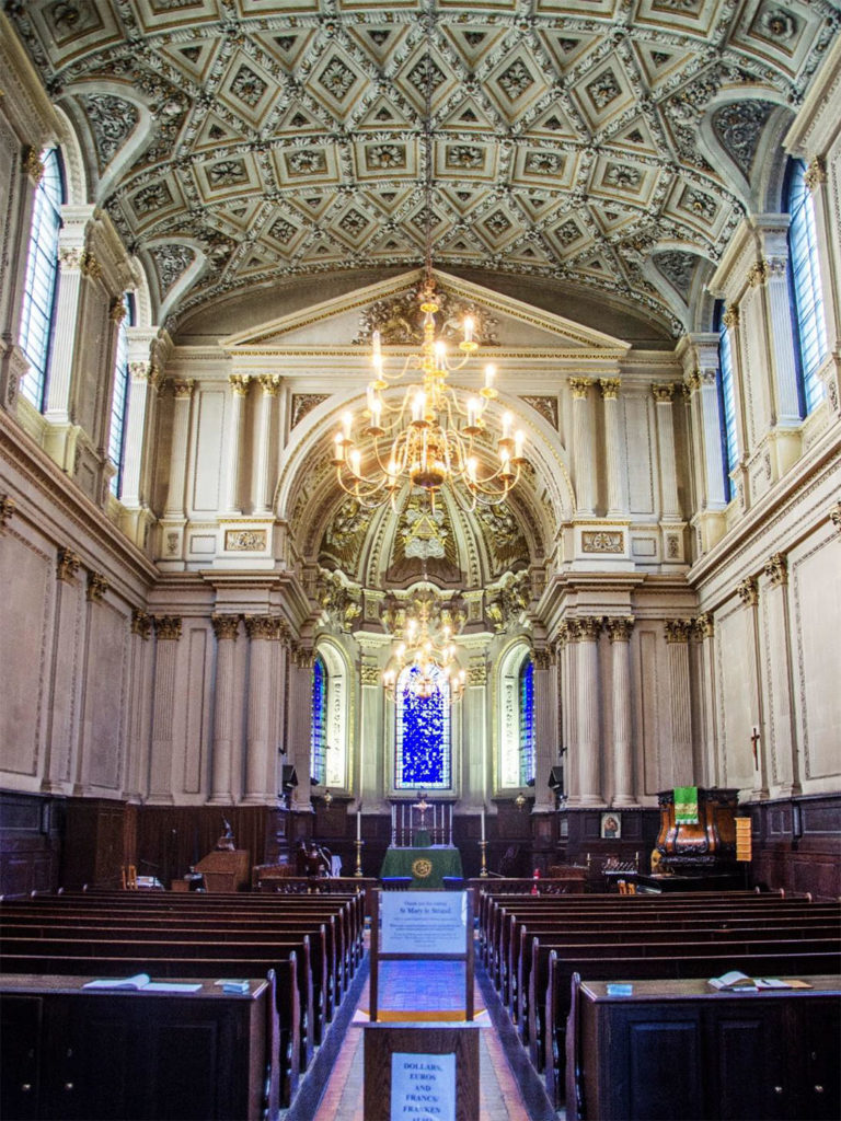
James Gibbs (architect of this building) explained how the clerestory lights at St Mary Le Strand were put at that level to avoid the external distractions of the Strand. He wrote:
‘It consists of two Orders, in the upper of which the Lights are placed; the Wall in the lower, being solid to keep out Noises from the street …’ (ref: Gibbs’ Book of Architecture).
Windows were installed high up for a functional reason. John Betjeman’s poem about the building included words with the same sentiment:
‘Windowless he designs his walls
Above the traffic’s roar …’
But was noise and distraction the only reason? Is there more we should say about these windows and the way he introduced daylight into the building?
How James Gibbs used light, and what is the meaning of light, appears to go well beyond the solely functional aspects of these clerestory windows, and discovery of the meaning in this building becomes one of its delights. It is easy to interpret more into the intentions of the architect than was ever consciously there. But great art and architecture allow this. A good designer provides more than he / she was briefed to provide and more than was strictly needed. At St Mary we find the position of these windows, and the light introduced at that level, do so more than reduce external disturbance.

Because the presence of light introduced by his high level windows, and the wider results convey a number of related ideas:
1. Light is theological
God is understood to be light and the author of light. It comes from above – from the canopy of the heavens, to be discovered and experienced here on earth.
Physical light, if it does not represent God as divine light, is a metaphor for this light. The building – so transparent at clerestory level with its band of windows both sides lets in lots of this light. Light is captured and hovers just below the ceiling. The presence of physical light as a representation of, and as a metaphor for divine light gets encapsulated within the building.
Indirect internal illumination of the building by reflection of this light off the ceiling is not at first obvious – possibly because the ceiling is dirty, and the windows so extensive. But it’s an ornate ceiling. Light from the clerestory windows illuminates this ceiling before reflection downwards. The ceiling in our imagination speaks of the glory of the heavenly canopy over us, and the weighty brilliance of the source of light.
2. Light is aspirational
We all need to be ‘enlightened’; and this building is a ‘church’: a place where enlightenment is meant to happen, and a place set apart to guide us away from the darkness which surrounds us, and from where we have emerged.
When we enter the building we arrive on an upper dark floor – surrounded by dark stained wainscot wall panels which in turn surround dark wooden pews. The surrounding darkness seems to represent this position on entry of un-enlightenment. But the light is there and above us if we will lift our eyes.
The very reason for this building’s existence is to do just that – introduce and lift us to the light. Light has an ethereal quality above – which becomes transformational if we aspire towards it.
3. Light is directional
It is also used to illuminate a path ahead – in this case from the entrance through the west door forward towards ‘the light’.
Light at high level is in large quantities, but hard to reach – but the angle of light from the windows on each side forms a V shape on the central aisle, lighting up the way towards the altar where the Eucharist is celebrated. The original architect – James Gibbs – was a Catholic. The altar sits below a blue (conveniently the colour of the sky) focal east window. And this is the place where we can meet and experience Christ as the light of the world in the bread and wine when the Eucharist is celebrated in the Chancel.

But these ideas are not just internally expressed. Externally we find light is used in similar ways to reinforce the same messages.
1. Light guides us to the place where we can find enlightenment
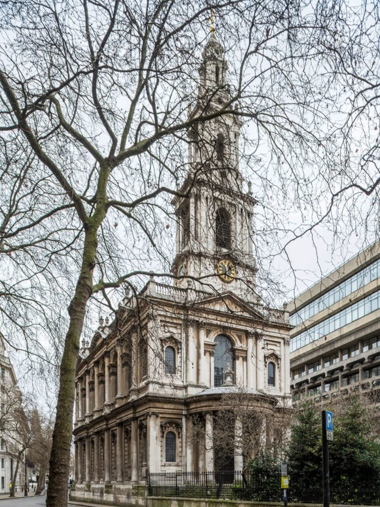
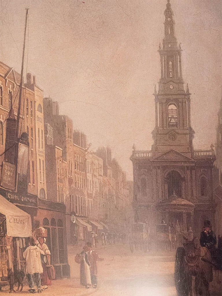
The building’s outline is wrapped in light: the balustrade and semi transparent steeple allow light through its fabric so we see a mixture of building and sky against the sky. Light is so incorporated into the edge of the building that it becomes a beacon in the city telling us where we can find enlightenment and direct us towards it.
The building is in effect a ‘lighthouse’ but one where light is directed inwards as well as outwards.
2. Use of light turns transcendence into immanence
The purpose of the building is further reinforced by capturing something of the transcendent untouchable canopy of light from the heavens above us within the outline of the building’s fabric to make it immanent and real in our experience here on earth.
The sky and it’s light we cannot touch, but when a building’s fabric captures the light within its masonry, light becomes something we begin not just to see, but can feel. It is no longer remote.
Light is not just transcendent and therefore unreachable; it is made humanely immanent and reachable. This is a combination unique to the Judaeo – Christian understanding of truth. And Gibbs achieves this in his building – particularly in the steeple.
3. Light lifts up our eyes so we are aware of the light and where it comes from.
In the same way the pews and panelling internally are dark at low level so that we can aspire upwards and heavenwards, the plinth externally at ground level is also ‘dark’ – featureless and dead; encapsulating three vaults in which bodies are buried and skeletons are still seen. But as our eyes rise upwards, the walls start to come alive. The first ‘stage’ above the plinth is blank as far as openings go, but lighter and modelled; then above, we have the clerestory windows in the second ‘stage’ which lets in the light and is reflective and transparent as well as light and modelled. Finally there are the balustrades through which we can now capture the sky.
But when we get to the steeple the building becomes almost transparent. Light penetrates everywhere: right through it, within its edges, as well as around it. The higher we aspire to go, the light becomes more evident and present.
4. And light gets celebrated
Light also plays on the modelled facades of the external walls. It creates a merry contrast between areas that are brightly lit in comparison to the shadows formed by recesses, bays, columns, pediments and pilasters. Natural light brings joy to us as we look at the building in the same way divine light is also meant to bring joy.
So whatever James Gibbs wrote about his windows, his clerestories, as part of the whole achieve much more than a function. And so they should. After all he was a darn good architect.

